
Have you ever entered a room and been overcome with serenity, vigour, or inspiration? Well, let me tell you, that experience was much influenced by the colour of the paint used in that room. Your house is a canvas, and the colours you pick for its walls have the amazing ability to affect your mood, foster harmony, and accurately represent your style.
Finding the ideal paint colour can be quite the adventure, whether you’re moving into a new house, remodelling your present home, or you’re just in the mood for some change. It’s important to choose a colour that properly captures the spirit of the space and its intended use rather than merely one that you enjoy.
- The Emotional Power of Colors
- The Influence of Natural Light
- The Art of Choosing a Color Palette
- Considering Room Size
- Neutral Colors: Versatility and Elegance
- Bold and Vibrant Colors: Making a Statement
- Earthy Tones and Natural Colors: Connecting with Nature
- Pastels and Soft Tones: Creating Serenity
- Paint Finishes: Gloss, Matte, and Everything In-Between
- Testing Paint Samples: A Crucial Step
- Getting Input from Experts
- Preparing for Painting: Gathering Supplies and Prepping Surfaces
- Painting Your Walls: A Step-By-Step Guide
- Wrapping Up
In this thorough guide, we’ll take you on a tour of the intriguing and occasionally baffling world of paint colours. To help you understand how the colours you select might affect your daily life, we’ll start by revealing the mysteries of colour psychology. Additionally, we’ll discuss the significance of natural light and how it can make or break your colour choice. Aside from that, we’ll demystify an array of colour schemes and empower you with all the resources you need to turn your living quarters into vivacious, mellow, and utterly individual sanctuaries.
When we’re done, you’ll understand not just the wonder of paint colours but also how they may impact your life. And I can assure you that you’ll be inspired to utilise this knowledge to design areas that genuinely reflect your personality and sense of style. Are you prepared for this vibrant experience now? Together, let’s take the first step!


The Emotional Power of Colors
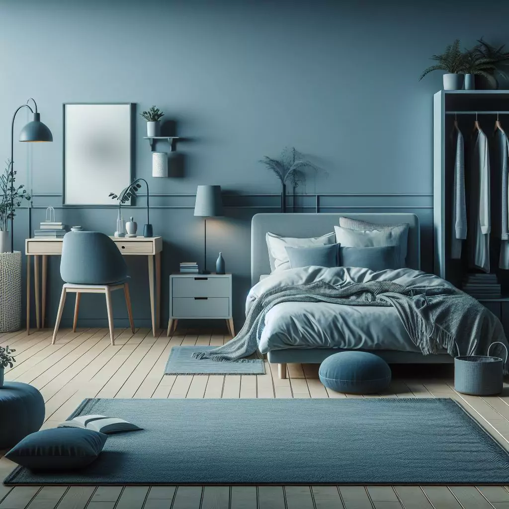
You know, it’s fascinating to think about how colours are so much more than just what meets the eye. They’re like emotional triggers, and they have this incredible power to influence how we feel and perceive space. Take, for instance, the soothing effect of blue. It’s like a gentle wave of calmness, making it a fantastic choice for bedrooms or cosy corners where you just want to unwind and find inner peace.
Now, let’s talk about red – it’s a whole different ballgame. This colour is all about passion and energy. Imagine a room bathed in fiery reds; it’s like an invitation to vibrant conversations and creativity. That’s why it’s such a thrilling choice for lively spaces like dining rooms and those areas where you entertain guests.
Then there’s green. This shade brings the freshness of the great outdoors right into your home. It’s like a breath of fresh air, associated with growth and renewal. Picture it in your home office or any space where you want to feel productive and re-energized.
Now, yellow – it’s like a burst of sunshine and happiness. It has this unique ability to make a space feel warm and welcoming, which is why it’s such a perfect match for kitchens and entryways. It just brightens up your day, you know?
And we can’t forget about grey. Even though it’s often seen as a neutral colour, it exudes sophistication and elegance. It’s like a versatile canvas that can complement a wide range of decor styles.
But really, these are just a few examples of the emotional impact that colours can have. There’s a whole world of possibilities out there! The trick is to think about not only what you personally like but also what you want the room to feel like and what its purpose is. That’s where the magic happens!
The Influence of Natural Light
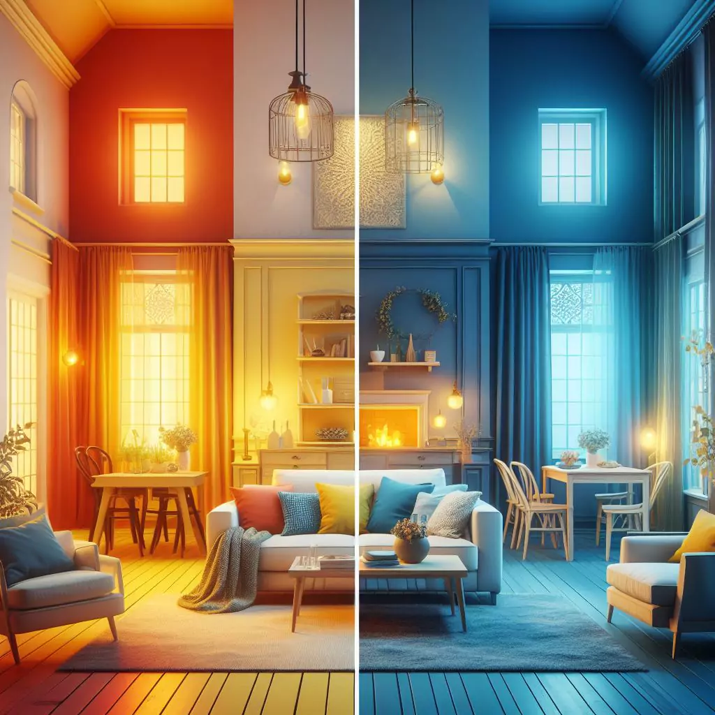
You know, one thing you’ll immediately notice while looking for the ideal paint colour is how much lighting affects how colours seem. As the day progresses, natural light, in particular, may perform its magic and dramatically change the atmosphere of a space.
Imagine waking up in the morning to find your bedroom drenched in this delicate, rose-coloured radiance. Thanks to the bright sunlight entering through your windows, it seems like an invitation to a warm, inviting atmosphere. Hold on to that concept though, since by noon, the same space can look quite different, especially in that harsh, glaring sunshine. That subdued rose tone might suddenly become a vibrant explosion of colour.
This is why determining how much natural light is present in your room is an essential first step in choosing paint colours. It’s comparable to selecting a wardrobe for your house that appears beautiful regardless of the lighting.
Rooms with lots of natural light are like empty canvases. To avoid overbearing brightness, you could choose to use lighter tones or pastels since the colours you choose will look more powerful and lively.
On the other hand, rooms with little natural light call for some skill. Darker tones may give a room a snug, private vibe, but they also run the danger of giving it a cave-like appearance. Consider utilising warmer colours to bring depth and warmth to such spaces.
To make the smartest choice, you’ve got to be a bit of a detective. Pay attention to how light dances in your space during the day. Check out how your chosen paint colours look in the morning, afternoon, and evening. You might even want to paint some sample patches on different walls and see how they react to the changing light. It’s like your very own science experiment in colour!
The Art of Choosing a Color Palette
After looking into colour psychology and taking into account the amount of natural light in your room, let’s get even further into the practice of choosing the ideal colour scheme. Think of this as our chance to furnish your house with a lovely and peaceful ambience.
Think of your colour scheme as a collection of hues, each of which contributes something special to the composition. The decision will rely on your style and the vibe you want to create. There are many possibilities available when it comes to colour palettes.
Take the monochromatic palette, which features several shades of a single colour. It’s sophisticated and well-balanced, like a bedroom painted in a variety of soothing blue hues ranging from the palest sky blue to the darkest navy.
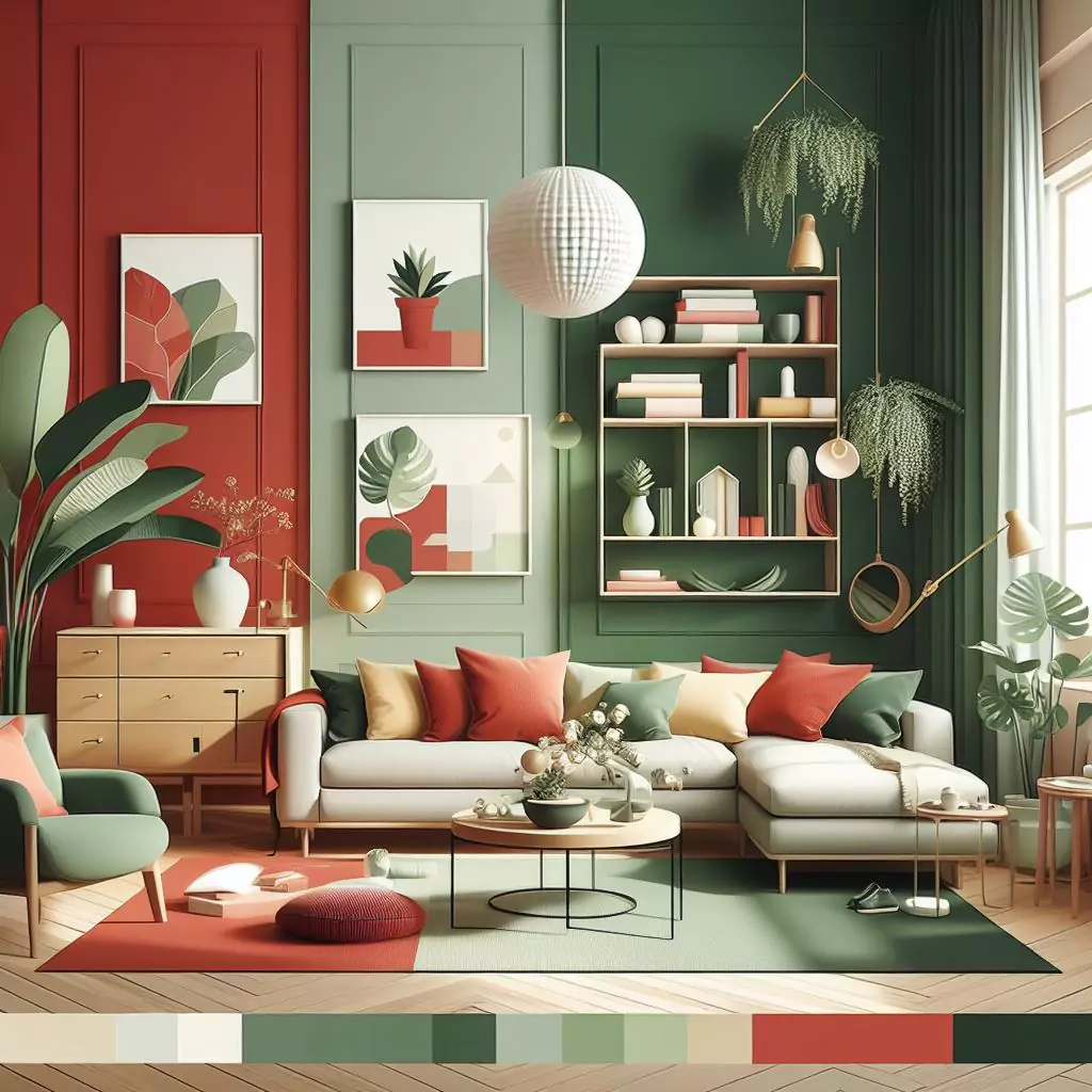
The complementary palette, on the other hand, employs colours that are in opposition to one another on the colour wheel. This brings drama and vitality to the space by creating a startling contrast. Imagine a living area with lively and well-balanced reds and greens.
The analogous palette, on the other hand, comprises hues that are close to one another on the colour wheel and have a similar undertone. It’s calming and well-organized, like adorning a kitchen with earthy, warm browns and oranges to create a cosy, connected atmosphere.
Additionally, we may experiment with the ratio of warm and cold tones. Cool colours like blues and greens promote quiet and tranquillity whereas warm colours like reds and yellows evoke vitality and cosiness. By striking a balance between them, you may create a welcoming atmosphere in your space.
But here’s what’s important: while choosing your colour palette, keep your current furniture and décor in mind. Do you have a focal point in mind, such as a colourful sofa or a one-of-a-kind piece of artwork? Your colour selections should complement, not contradict, these components.
Colour palette creation is an art form, and this is where your creativity may truly flourish. Nature, art, fashion, and even your favourite trip places may serve as sources of inspiration. We’ll create an environment that feels uniquely yours by selecting colours that resonate with you and your area.
The size of a room can affect your colour selections. We’ll also look at ways to make a visual connection between adjacent areas in the section that follows. Let’s get on with our search for the ideal paint hue for your house.
Considering Room Size
It’s remarkable how much a room’s size can affect its feel when deciding on the correct paint colour. It’s important to know how a colour may change how your home’s interior is seen in addition to choosing a colour you enjoy.
To make a space feel bigger, it’s common practice to use bright, airy colours in smaller spaces. Without a doubt, that can work, but you are not restricted to using only light colours. With the proper dark or rich colours, a tiny space may occasionally become quite cosy and welcoming. Finding the right balance is key, and anything too overbearing should be avoided.
Small rooms tend to be opened up by light hues like soft pastels, pale blues, and light greys, which reflect more natural light and give the impression of being airier. Surprisingly, though, dark hues may also be effective in compact areas. Rich greens, warm browns, and deep blues may give depth and create a cosy, cocoon-like atmosphere. You may always use these deeper colours as accents or on an accent wall if you’re concerned that it will seem too enclosed.
Oh, and in small spaces, mirrors and reflected surfaces may be your best friends. They may enhance natural lighting and enlarge the appearance of the space. So, to reflect light, think about putting mirrored pieces of furniture or ornamental mirrors on the walls.
Talk about bigger rooms now. They provide you with a little more creative licence, but you still need to be cautious to avoid making them appear sterile or void. Rich reds, intense oranges, and earthy browns are warm colours that work wonders to make a vast space feel cosier and more inviting. It all comes down to establishing an intimate atmosphere in the large room.
However, if you want a more opulent atmosphere, cold colours like quiet blues, restful greens, and peaceful greys may provide a sense of refinement and tranquillity while retaining that large impression. Accent walls are also important to consider since they may completely transform a room by providing visual interest and dividing it into separate areas.
If your house has an open floor plan or linked sections, it’s critical to consider establishing a visual flow with your colour selections. You want to feel at ease as you wander from room to room.
One option is to choose a unifying colour that links everything together, whether it’s a neutral or a complementary hue from your selected palette. When bringing a new colour into a neighbouring room, do so gradually. Use carpets, artwork, or décor pieces to link the colours and make it all seem cohesive.
Always keep sightlines in mind. To ensure that the colours in your line of sight go well together, consider what you can see from one room into the next. Whatever the size or configuration of your area, it’s all about creating a unified and cosy atmosphere that makes the most of your available space.
Neutral Colors: Versatility and Elegance
Few things surpass the classic beauty and adaptability of neutral tones in home design. Neutrals, such as whites, greys, beige, and mild browns, create a classy and long-lasting backdrop that may accommodate a variety of styles and tastes. Whether you want a trendy minimalist appearance or a comfortable farmhouse atmosphere, neutrals are your go-to interior design partners.
The Endless Possibilities of Neutral Colors
One of the most enticing characteristics of neutrals is their versatility. They can act as a blank canvas for you to overlay your style on. Neutrals produce a sense of serenity and balance, making them a good choice for settings where a quiet mood is desired.
Popular Neutral Shades and Their Undertones
There is a huge range to explore within the area of neutrals. Each shade of white, grey, or beige has its undertones, which may have a considerable impact on the overall appearance and feel of a space.
- Pure White: Pure white is a perfect blank slate. It’s light and airy, and it looks great in modern and minimalist settings. However, be cautious since it might seem harsh in places with plenty of natural light.
- Warm Whites: Warm whites with accents of yellow or beige create a pleasant and welcoming atmosphere. They complement classic, rustic, and homey décor themes.
- Cool Whites: Cool whites with touches of blue or grey provide a contemporary and clean appearance. They’re great for modern and Scandinavian-inspired decor.
- Greige (Gray-Beige): Greige is a popular neutral that mixes beige’s warmth with grey’s refinement. It’s a very adaptable option that compliments a broad range of décor styles.
- Taupe: Taupe is a warm and earthy neutral with brown and grey undertones. It may bring depth and character to a room without being overpowering.
- Soft Gray: The use of soft grey tones creates a calm and beautiful ambience. They’re a popular choice for contemporary and transitional decor.
- Incorporating Neutrals into Different Rooms: Neutrals can be used in every space of your house, including the living room, bedroom, and kitchen. Here are some examples of how to incorporate neutral colours:
- Living Room: Warm beige walls with subtle grey accents make for a pleasant room. Dark wood furniture and metallic accents provide depth.
- Bedroom: Soft blue-grey walls and clean white linen will transform your bedroom into a tranquil haven. For a calming atmosphere, include natural materials such as linen and wood.
- Kitchen: With white cabinets, grey subway tile backsplash and warm wood accents, you can create a timeless kitchen. In the kitchen, neutrals provide a clean and friendly atmosphere.
- Bathroom: Design a sophisticated bathroom with marble-inspired tiles, grey-blue walls and chrome fixtures. Bathroom neutrals create a sense of luxury and comfort.
Neutral colours are the design world’s chameleons. They have this wonderful ability to mix in with almost any design or décor you have in mind. Whether you want a serene, Zen-like hideaway or a sleek, modern aesthetic, neutrals are the solid foundation that sets the tone for your dream home.
But hey, if you’re feeling a little more daring and prepared to give your house some life and personality, let’s explore the bright world of strong and stunning colours. These colours aren’t timid; they’re here to stand out and give your living spaces that additional spark. If you’re ready for a colourful adventure, keep reading to learn how to infuse your house with life.
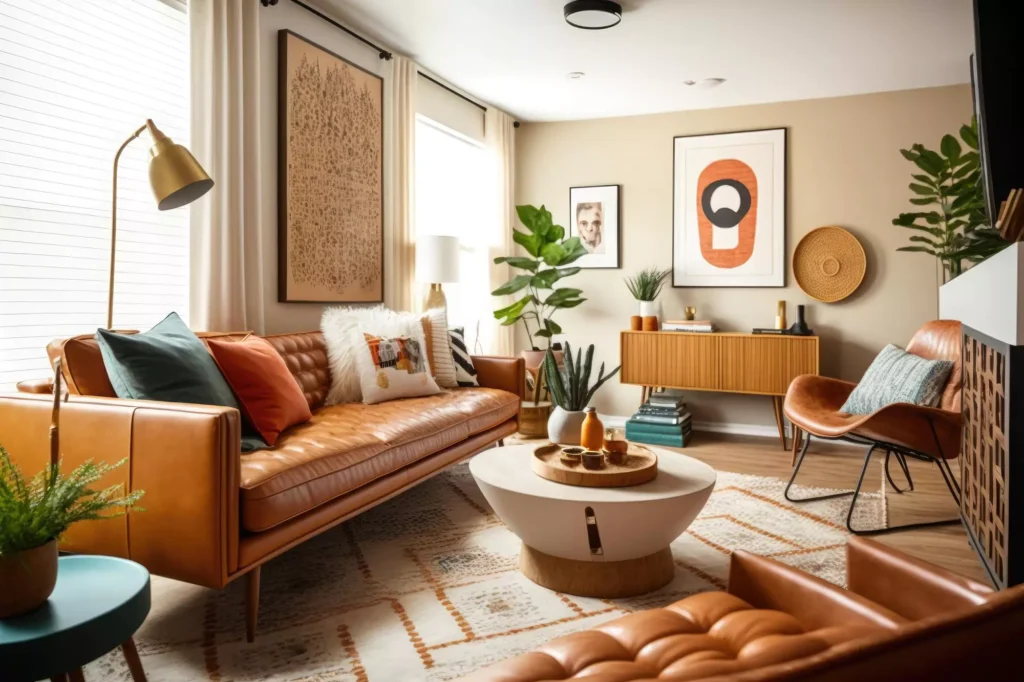
Bold and Vibrant Colors: Making a Statement
Do you happen to be the kind of person who just loves an extra dose of energy, a dash of creativity, and a hint of drama in your living spaces? Well, let me tell you, bold and vibrant colours could be your secret sauce to achieving that design nirvana you’re after. These colours are fearless in the way they make an impression, and when you employ them with a bit of consideration, they can inject a whole lot of life and character into your home.
Adding Personality with Bold Color Choices
Bold colours, as you may know, are kind of like the superheroes of interior design. They suddenly appear with this amazing ability to transform a commonplace area into something very spectacular. The opportunity to make a statement that shouts, “This is me, this is my style!” is presented by choosing a rich, jewel-toned hue or possibly a brilliant, saturated colour. It’s like giving your home a little bit of your individuality.
The Impact of Accent Walls
Accent walls are one of the best ways to use strong colours in a space. An accent wall is a single wall that is painted a distinct colour from the other walls in the space. By using this method, you may enjoy the brilliance of strong hues without making the room feel too colourful.
- Focal Point: A room’s focal point is created by an accent wall, which draws attention and adds aesthetic appeal. It’s a great option for spaces where you want to draw attention to a specific location or architectural detail.
- Choosing the Right Wall: Typically, an accent wall is the wall behind the headboard in a bedroom, the wall with a fireplace in a living room, or the wall behind a dining table in a dining room. Feel free to get creative and select a wall that speaks to you.
- Balanced Complement: Consider using a shade from your colour scheme that goes well with the other walls when picking a strong hue for an accent wall. This guarantees that the space is in perfect harmony.
Coordinating Vibrant Colors
While bright hues might draw attention to themselves, they must complement the rest of the area. Here are some ideas for combining bright colours:
- Balance with Neutrals: Combine bright hues with neutral tones such as white, grey, or beige. This strikes a balance that keeps the space from seeming overly crowded.
- Use Color Accents: Decor elements such as toss pillows, carpets, artwork, and accessories may let you incorporate bold hues in lesser amounts. This creates coherence and avoids colour overkill.
- Complementary Colors: Consider mixing complementary hues for a bright and dynamic atmosphere. Colours that are opposite each other on the colour wheel, such as red and green or blue and orange, are examples. They produce a bright contrast that is aesthetically appealing.
- Tone It Down with Pastels: If you like bright hues but want to keep things balanced, mix them with soft pastels. The contrast between bright and pastel colours may be aesthetically appealing.
Bold, vivid colours make a strong impression. They are suitable for people who want their homes to reflect their vibrant personality. These striking colours can truly bring character and energy to your house, whether you want to add an eye-catching accent wall or sprinkle some vivid décor about.
But let’s also take time to reflect on the calming effects of natural colours and earthy tones. They are influenced by nature and have the unique capacity to make your living spaces seem warm, grounded, and welcome. It can be incredibly amazing since it’s like bringing a little bit of nature inside.
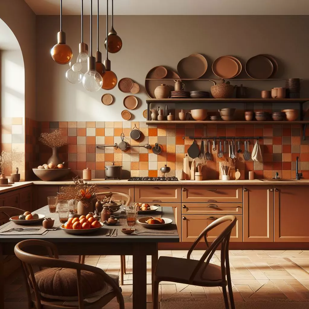
Earthy Tones and Natural Colors: Connecting with Nature
Imagine entering a room and feeling as though Mother Nature herself is giving you a warm hug. The beauty of nature enters your house through a mystical doorway created by earthy tones and those natural colours. They almost seem to whisper serenity, enveloping you in a warm, secure sensation and creating a strong link with the outside world.
The Calming Influence of Earthy Hues
Earthy tones, those colours drawn from the exquisite shades of the earth itself, have an amazing way of bringing you back to your centre and restoring your equilibrium. It appears as though they have brought nature itself into your home. Some colours make you think of luscious soil, strong stone, the cosiness of wood, and the verdant greens of leaves. If you’re all about fostering that serene and harmonious atmosphere in your house, they’re just perfect.
Earthy tones can be used in various rooms to create different moods and aesthetics.
- Bedrooms: Soft, earthy tones like warm terracotta, sage green, or dusky rose can help you create a tranquil and relaxing bedroom. These colours inspire relaxation and peace.
- Living Areas: Consider applying richer earthy tones in living rooms and family rooms, such as deep browns, warm greys, and olive greens. These colours may create a warm and inviting atmosphere.
- Kitchens: Earthy tones may provide a sense of warmth and comfort in the centre of the home. Consider natural wood cabinetry, stone worktops, and muted earthy tones for a rustic retreat-style kitchen.
Combining Natural Colors with Textures and Materials
Pair earthy tones with textures and materials that recall the natural world to truly embrace the natural colour palette.
- Wood: Decorate with wood components such as wooden furniture, hardwood flooring, or exposed wooden beams. Wood compliments earthy tones wonderfully, resulting in a unified effect.
- Stone: Granite or marble surfaces can give a sense of luxury while remaining true to the rustic motif. Consider incorporating stone elements into your kitchen or bathroom.
- Textiles: If you want to give your room texture and warmth, choose materials like wool, jute, and linen. Natural materials complement the earthy colour scheme and provide a warm and tactile atmosphere.
- Plants and Greenery: Add greenery and indoor plants to your homes. They not only provide a breath of fresh air but also strengthen our bond with nature.
For individuals who desire a sense of peace and tranquillity in their living spaces, earthy tones and natural colours offer a soothing and timeless look. These hues may provide a warm and grounded environment whether you’re going for a contemporary haven or a rural hideaway.
Pastel colours and gentle tones will be used in the next part to examine the softer end of the colour spectrum. These delicate colours are favoured for bedrooms, nurseries, and other areas where relaxation is important since they may produce a calming and dreamlike mood.
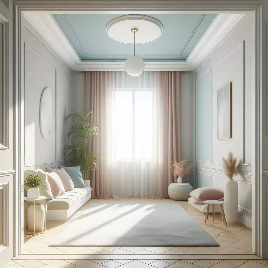
Pastels and Soft Tones: Creating Serenity
There’s something genuinely remarkable about environments that make you feel completely calm and quiet. As a relaxing lullaby, quietly whispering relaxation, peace, and a touch of exquisite elegance into your living areas. That is the enchantment of pastels and gentle tones. They have this remarkable power to create an ambience that envelops you in peace and soothing beauty.
Creating a Soothing Atmosphere with Pastel Shades
Pastels are a delicate, subdued hue family with a whisper-like aspect. They’re easy on the eyes and provide a calm atmosphere that’s ideal for unwinding and relaxing.
Pastel shades are particularly popular in spaces where tranquillity and comfort are paramount.
- Nurseries: Soft pastel shades like soft pink, baby blue and mint green are traditional nursery colours. They provide a peaceful and relaxing atmosphere for your child.
- Bedrooms: Pastel colours in bedrooms can make the area feel like a peaceful sanctuary. Imagine waking up with walls that are a lovely peach or lavender colour.
- Bathrooms: Bathrooms with pastel colours provide a feeling of private retreat. A spa-like ambience may be achieved with soft blues, seafoam greens, and subtle lilacs.
Pairing Soft Tones with White or Neutral Accents
Consider using white or neutral accents with pastels to truly enjoy their tranquillity. It also gives the appearance a timeless, beautiful, clean feel.
- White Furniture: White furniture pieces, such as a bed frame or a dining table, can create a beautiful contrast against pastel walls.
- Neutral Bedding: To complement the pastel walls, use neutral-coloured bedding and linens in the bedroom. White or beige bedding produces a relaxing and pleasant atmosphere in the bedroom.
- Subtle Patterns: To give depth to the light tones, include subtle patterns or textures in your design. Consider textured wall coverings or pastel-coloured throw cushions with delicate designs.
- Light and Airy Curtains: To let in a lot of natural light, use light and airy drapes in white or a soft neutral colour. For rooms where you wish to relax and find refuge, pastels and soft tones give a classic and romantic design. Pastel colours may provide a calming and beautiful ambience whether you’re decorating a nursery, a bedroom, or a peaceful area of your house.
After exploring a variety of colour families, it’s time to get technical with paint finishes. Let’s explore the secrets of various paint finishes and learn how to choose the best one for each area. The finish you choose will have a big influence on the overall appearance and feel of your walls.
Paint Finishes: Gloss, Matte, and Everything In-Between
picking the perfect paint colour is just the beginning of this whole process. What’s equally important is the finish you decide on because it can truly transform how that colour shows up on your walls and the overall vibe of the room. We often call these finishes “sheens,” and they come in different levels of glossiness or shine. Now, here’s the trick: each of these finishes has its unique traits, and getting a grasp of them is essential if you want to achieve that precise look you’re aiming for in each room.
Understanding Different Paint Finishes
Depending on how glossy or sheeny they are, paint finishes are categorised. Some of the most popular paint finishes are listed below:
- Flat or Matte: Flat finishes are pretty neat. They don’t have any shine to them, which gives your walls this smooth, velvety texture. Plus, they’re excellent at hiding any little imperfections your walls might have. That’s why they’re such a great choice for spaces like bedrooms, dining rooms, and even ceilings. They create a calm and serene atmosphere, perfect for relaxing or enjoying a meal with family and friends.
- Eggshell: Eggshell finishes resemble the gloss of an eggshell’s surface in their subtlety. They are appropriate for living rooms, corridors, and bedrooms since they have a little bit more washability than flat finishes.
- Satin: While less glossy than semi-gloss but more noticeable than eggshell, satin coatings feature a soft shine. They are a sensible option for high-traffic areas like kitchens and bathrooms since they are simple to clean.
- Semi-Gloss: Semi-gloss coatings are extremely durable and have a visible sheen. They are perfect for damp environments like bathrooms and kitchens. Trim, doors, and cabinets frequently use semi-gloss paint finishes.
- Gloss: Gloss coatings provide the most shine and reflection. They are extremely durable and simple to clean. Gloss finishes are normally reserved for trim and doors, but some adventurous decorators utilise them on walls in modern homes to make a striking statement.
Choosing the Right Finish for Each Room
Selecting the appropriate paint finish for each room is essential to achieving the desired look and functionality.
- Flat or Matte: Use flat or matte finishes in areas where you want to create a soft and inviting atmosphere. These finishes are ideal for bedrooms, dining rooms, and ceilings.
- Eggshell: Eggshell finishes are a good mix between matte and satin. They are adaptable and look great in living areas, bedrooms, and corridors.
- Satin: Satin finishes are practical for areas that require frequent cleaning, such as kitchens, bathrooms, and children’s playrooms.
- Semi-Gloss: Semi-gloss coatings should be reserved for trim, baseboards, doors, and cabinets. Their high shine gives a sense of refinement while also making them simple to maintain.
- Gloss: Trim, doors, and cabinets are often the only surfaces with gloss finishes. For most wall applications, they could be overly reflective, yet they produce a strong, contemporary effect.
When you’re deciding on the perfect paint finish, it’s essential to think about both the look you want and the practical side of things. Consider how the room will be used – is it a high-traffic area like a kitchen or a more relaxed space like a bedroom? Also, think about moisture levels because places like bathrooms may need a different finish. And, of course, consider the overall vibe you want to create in the room. It’s all about finding that sweet spot between aesthetics and functionality.
Now, let’s talk about something equally crucial: testing paint samples. It’s a practical step in the process that can make a big difference. You see, the colour you choose might look fantastic on a tiny paint chip, but it might surprise you once it’s on your walls. Testing paint samples helps you see the real deal in your space, with your lighting and surroundings. It’s a surefire way to make sure you’re getting the look you truly want.
Testing Paint Samples: A Crucial Step
Picking a paint colour just by looking at a small swatch or an image on your screen can be a bit dicey. Colours often seem quite different on a tiny paint chip or your computer monitor compared to how they’ll appear on your walls, especially under your specific lighting. That’s why trying out paint samples is crucial when you’re in the process of choosing the perfect paint colour.
Why Testing Paint Samples Is Essential
Testing paint samples serves several critical purposes:
- True Color Representation: It allows you to see the true colour of the paint in your specific space, taking into account the lighting, architecture, and surroundings.
- Compatibility: It makes sure that the hue you’ve picked blends seamlessly with the room’s other furnishings, decorations, and accents.
- Lighting Variation: Testing allows you to examine how the colour appears at various times of the day because paint colours can seem different in different lighting situations.
- Mood and Atmosphere: You could assess how the colour impacts the overall atmosphere and mood of the room by testing paint samples.
How to Properly Apply and Evaluate Paint Samples
To test paint samples effectively, follow these steps:
- Gather Supplies: You’ll need paint samples of the colours you’re considering, paintbrushes, small paint trays, painter’s tape, and white poster boards or sample boards.
- Prepare the Surface: Clean and prepare the wall surface by filling any holes or imperfections and sanding as needed.
- Use Sample Boards: Using sample boards is a less intrusive alternative to applying paint samples directly to your walls. The colours of choice should be painted on tiny portions of posters or sample boards.
- Apply Two Coats: Each colour should be applied twice on distinct sample boards. This makes sure that you can see the paint’s complete coverage and intensity.
- Place Sample Boards: Place the sample boards in different parts of the space that you want to paint. Consider how the colours appear throughout the day and under various lighting situations.
- Consider the Surroundings: Be aware of how the colours affect the room’s other furnishings, accessories, and décor. Pay attention to the environment and emotions they evoke.
- Live with the Samples: For a few days or maybe a week, keep the example boards visible. To see how the hues affect you over time, live with them.
- Evaluate in Different Lighting: Assess the colours in natural daylight, artificial lighting, and during the evening. Lighting can have a significant impact on how the colours appear.
- Compare and Contrast: To choose the hue that best complements your concept for the room, compare the sample boards side by side.
Testing paint samples is a key step when deciding on the right paint colour for your walls. Selecting a final colour should make you feel knowledgeable and self-assured. Additionally, here’s a little tip: bear in mind that paint colours might seem different throughout the day due to changes in lighting. So take your time and make sure everything is perfect before moving forward.
Next, let’s discuss consulting experts, which is something equally crucial. Here, we are discussing interior designers and expert painters. These specialists have a lot of experience that may be very helpful in guiding you in choosing the crucial paint colours and creating the desired style and feel for your house.
Getting Input from Experts
Picking the perfect paint colour for your home can feel like quite the adventure, don’t you think? It’s exciting to envision how it’ll transform your space, but I get that it can also be a bit intimidating. But here’s the thing – you don’t have to go it alone. Getting some expert advice can be a game-changer. You could chat with professional painters, or maybe even team up with an interior designer. And don’t forget those handy online tools and apps; they’re like your digital sidekicks, offering valuable insights to help make your vision a reality. It’s all about making sure your home turns out just the way you want it to.
Consulting with Professional Painters
While picking the ideal paint colour for your house may be a fun endeavour, it can also be a little intimidating at times, don’t you think? The professionals can make a difference in realising your ideas in this situation. Therefore, their insights might be like your secret weapon for a great conclusion whether you’re speaking with expert painters working with interior designers, or maybe even using some useful web tools and applications.
Start with qualified painters. These individuals are true authorities in their profession and have a wealth of information and expertise to share. From selecting the finest paint brands, finishes, and kinds for your project to matching the colours of existing paint, they can assist you in a variety of ways. Additionally, they are masters at cleaning your walls and ensuring that the paint applies evenly for a polished look.
And then there are the interior designers. These creative minds do so much more than just pick colours. They’re all about creating spaces that not only look amazing but also work beautifully. They’ll recommend colours that perfectly complement your furniture, decor, and architectural elements. And they can work their magic on furniture placement, lighting, and decor arrangements, creating a space that’s not just visually appealing but also functional. With their knack for personalization and access to a vast network of suppliers, they can truly make your home uniquely yours.
You may visualise how different colours will appear in your area with virtual room painters. You may use colour-matching tools to locate the precise shade you’ve been looking for. Furthermore, sites like Pinterest and Houzz, which are brimming with images of exquisitely designed spaces, are like inspiration gold mines. With only a few clicks, you may explore several colour schemes and collect ideas.
So, whether you’re seeking guidance from the pros or having a blast with online tools, these resources can streamline your journey to finding that dream paint colour. And trust me, your vision for your home is absolutely within reach.
Now, let’s dive into the nitty-gritty of painting preparation in the next sections, where we’ll get you ready for that exciting DIY project of yours.
Preparing for Painting: Gathering Supplies and Prepping Surfaces
It’s needed to set things up properly before picking up your paintbrush and beginning your painting endeavour. The right planning, in other words, is kind of like the secret ingredient that helps your painting project go smoothly and successfully, giving you the amazing results you’re going for. Let’s get started by going through all the necessary preparations for painting, from gathering your materials to making sure the surfaces are clean and ready to proceed.
Gathering the Necessary Supplies and Tools
You will require a selection of necessary materials and tools to begin your painting endeavour. To make sure you have everything you need, use the following checklist:
- Paint: Buy the paint in the shade and finish what you’ve decided on for your project. Based on the area you’re painting, calculate the quantity of paint you’ll need.
- Primer**: Depending on the condition of your walls and the type of paint you’re using, you may need a primer. Primer helps the paint adhere better and provides a uniform surface.
- Paintbrushes: Invest in high-quality paintbrushes that are suitable for the project and the type of paint you’re using. When cutting in edges and corners or painting huge areas, several brush sizes and shapes are appropriate.
- Roller and Roller Covers: For speedy and effective painting of big areas, a roller is required. Make careful you choose the proper roller cover nap (roller cover thickness) for your surface texture.
- Painter’s Tape: Painter’s tape is used to mask off areas you don’t want to paint, such as trim, baseboards, and ceilings. It helps create clean lines and prevents paint bleed.
- Drop Cloths or Plastic Sheeting: Protect your floors and furniture by covering them with drop cloths or plastic sheeting. This prevents paint splatters and spills from damaging surfaces.
- Paint Tray: A paint tray is used to hold paint when using a roller. It makes the painting process more efficient and minimizes the need to dip the roller frequently.
- Paint Tray Liners: Liners for your paint tray make cleanup easier and allow you to switch between colours more seamlessly.
- Paint Stirrer: Use a paint stirrer to thoroughly mix the paint before starting your project. This ensures consistent colour and sheen.
- Extension Pole: An extension pole can be attached to your roller handle to reach high or difficult-to-access areas without the need for a ladder.
- Sanding Materials: Sandpaper or sanding blocks may be necessary to smooth rough or uneven surfaces before painting.
- Caulk and Caulk Gun: Caulk is used to fill gaps and cracks in walls, trim, and other surfaces. A caulk gun helps apply caulk evenly.
- Patch and Repair Materials: If your walls have holes, dents, or other imperfections, you’ll need patching and repair materials to fix them.
- Preparing and Protecting Your Space: Once you’ve gathered your supplies, it’s time to prepare and protect your space for painting.
- Clear the Room: Remove furniture, decor, and other items from the room, or move them to the centre and cover them with drop cloths or plastic sheeting.
- Clean the Walls: Clean the walls to remove dust, dirt, and grease. A clean surface ensures proper paint adhesion.
- Patch and Repair: Fill holes, cracks, and imperfections in the walls with patching compound. Allow it to dry, then sand the patched areas smooth.
- Protect Fixtures and Trim: Use painter’s tape to mask off fixtures, trim, baseboards, and ceilings. This protects them from accidental paint splatters.
- Cover Floors: Cover the floors with drop cloths or plastic sheeting to prevent paint from dripping or spilling onto them.
- Ventilate the Area: Ensure proper ventilation by opening windows or using fans to circulate air. Adequate ventilation helps paint dry faster and reduces fumes.
- Wear Appropriate Attire: Wear clothing and footwear that you don’t mind getting painted on. Additionally, consider wearing safety glasses and a dust mask, especially when sanding.
When you gather all the stuff you need and take the time to get your space ready just right, you’re getting everything set for a successful painting job. This prep work not only saves you time but also keeps things neat, and it’ll give your walls that pro-level finish you’re after. In the next part, I’ll walk you through the whole painting process, step by step, like I’m right there with you.
Painting Your Walls: A Step-By-Step Guide
Painting your walls can be a pretty satisfying and rewarding do-it-yourself project. And the good news is, you don’t need to be a pro to get that professional look. So, let’s go through it step by step. We’ll start by cutting in the edges and finish up by applying multiple coats of paint. Easy, right?
Step 1: Prepare Your Space and Gather Supplies
- Ensure that the space is appropriately prepped and that you have all of the relevant materials and tools on hand.
Step 2: Start with Cutting In
- Begin by using a paintbrush to cut in the margins of the walls. Painting places that are too tight or tiny for a roller, such as corners, edges, and around fixtures, falls under this category.
- Dip the paintbrush about one-third of the way into the paint and wipe away any extra paint on the can’s rim.
- Keep the paintbrush steady and paint a straight line around the borders. If necessary, use painter’s tape as a guide for straight lines.
Step 3: Roll the First Coat
- Use a roller to apply the first coat of paint to the larger, open areas of the wall.
- Start from the top of the wall and work your way down in sections, overlapping each pass slightly.
- Apply even pressure to the roller for a consistent finish
Step 4: Maintain Wet Edges
- Always keep moist edges to avoid lap marks and give a smooth finish. Working rapidly and without allowing the paint to dry between portions is required.
Step 5: Repeat for Additional Coats
- Let the first coat dry completely, following the manufacturer’s recommended drying time
- Add more coatings as necessary. For proper coverage and colour uniformity, most paint applications require at least two coats.
Step 6: Remove Painter’s Tape
- Carefully remove the painter’s tape while the paint is still slightly wet to achieve clean, sharp lines.
Step 7: Inspect and Touch Up
- After the final coat has dried, inspect the walls for any missed spots, drips, or imperfections.
- Touch up any areas that need additional paint or correction.
Step 8: Clean Up
- Clean your brushes, rollers, and other painting tools with soap and water or the recommended cleaning solution.
- Dispose of paint cans and materials properly according to local regulations.
Step 9: Reassemble and Decorate
- Once the paint is completely dry, reassemble the room by placing furniture, decor, and other items back in their original positions.
- Decorate your newly painted space to your liking and enjoy the refreshed look of your room.
Step 10: Maintain Your Painted Walls
- To keep your painted walls looking their best, clean them periodically using a mild detergent and a soft cloth or sponge.
- Address any scuffs, marks, or stains promptly to prevent them from becoming permanent.
When you follow these simple steps and focus on the details, you’ll be able to paint your walls with confidence and get that pro-quality finish. It doesn’t matter if it’s just one room or your whole house – a good paint job can completely change how your home looks and make it feel brand new.
Wrapping Up
Transform your living spaces with the right paint colours that reflect your style and personality. Explore diverse colour families to discover the possibilities and create a mood, emotion, and environment that define your home. Choose neutrals for creativity, bold colours for personality and energy, earthy tones for warmth and serenity, and pastels for a calming sanctuary. Understand paint finishes and evaluate paint samples to ensure that colours come to life on your walls. Your home is a warm and welcoming sanctuary that reflects your unique style and flair. So, grab that paintbrush, and let the magic begin!
You’ve learned the information needed to make educated decisions as we’ve dug into the interesting colour psychology, the influence of natural light, and the relevance of space size. You are not simply selecting colours; you are establishing a mood, an emotion, and an environment that will identify your house.
Explore the diverse colour families to uncover the possibilities. The ideal setting for your creativity is provided by neutrals because of their adaptability and ageless quality. You can make a statement with bold and brilliant colours, which also give your room a sense of life and personality. Warmth and serenity are provided by earthy tones, which connect you with the natural world. Additionally, tranquillizing pastels turn your house into a calming haven.
However, picking colours is only the first step; the next is to ensure that they truly “come to life” on your walls. Understanding paint finishes and evaluating paint samples are crucial first steps because of this. The colours you choose should appear just as lovely in your room as they do on those small paint chips.
Your house is a warm and friendly haven that reflects your individuality and flair. It’s more than simply a new coat of paint; it’s a complete metamorphosis. You can breathe new life into your living spaces, whether you are starting on a little room makeover or a large house remodel.
So, pick up that paintbrush, my buddy, and let the magic begin. Your home renovation awaits, and with the appropriate colours, methods, and a splash of imagination, you’re about to embark on an unforgettable trip. Cheers to the lovely spaces you’re going to design!
-
 IDEATECH Reusable Food Storage Bags$21.00
 -
SPLF Reusable Silicon Storage Bags$14.00
-
Lerine Reusable Silicon Bags$13.00
-
Zip Top Reusable Silicone Bags$89.00
-
HOMELUX THEORY Reusable Ziploc Silicone Bags$24.00
-
Stasher Silicone Reusable Food Storage Bags$45.00
-
Chef’s Path Food Storage Containers, 24 Piece$59.99
-
Product on saleVtopmart Airtight Food Storage Containers, 7 PiecesOriginal price was: $39.99.$26.99Current price is: $26.99.
-
Product on saleBentgo® 20-Piece Lightweight, Durable, Reusable BPA-Free 1-Compartment ContainersOriginal price was: $13.99.$11.99Current price is: $11.99.


Pingback: What to Keep in Mind Before Shopping for Home Products - Wow Home Shop
Pingback: How to Hang Wall Art and Decor (without damaging) - Wow Home Shop
Pingback: Customize with Confidence: Painting IKEA Furniture Like a Boss! - Wow Home Shop
Pingback: Your Furniture Deserves the Best Paint: Learn How Here! - Wow Home Shop